From Logo to Full Brand Identity: Bella’s Bakery Story
Building a memorable brand is about much more than just designing a logo. It’s about creating an identity that captures the spirit, values, and personality of a business. When Bella’s Bakery approached us, they wanted to go beyond just a logo. They envisioned a complete brand identity that would resonate with customers and reflect their passion for crafting delicious, homemade baked goods. Here’s how we collaborated with Bella’s Bakery to transform their ideas into a cohesive, meaningful brand identity.
Understanding Bella’s Vision
Before diving into the design, we started with a thorough consultation with Bella and her team to understand what Bella’s Bakery was all about. Bella shared her love for baking, which began in her grandmother’s kitchen, and her goal of creating a warm, nostalgic environment for customers. She wanted the bakery to be a place where people could enjoy homemade treats made with love and traditional recipes.
Bella’s vision was clear: she wanted a brand that felt homey, welcoming, and vintage-inspired, but with a modern touch. The goal was for customers to feel like they were stepping into a cozy kitchen where every treat was crafted with care. This initial conversation set the foundation for our design approach, giving us a deep understanding of Bella’s values and aesthetic preferences.
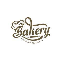
Step 1: Designing the Logo
The logo would serve as the cornerstone of Bella’s Bakery’s brand identity, so it needed to capture the essence of the business in a single image. After gathering all of Bella’s ideas and inspirations, our design team set to work, focusing on these key elements:
- Nostalgia: We wanted to evoke a sense of warmth and tradition, reminiscent of homemade baking.
- Simplicity: The logo needed to be easily recognizable and adaptable across various branding materials.
- Colors and Fonts: Bella expressed a love for soft, pastel colors and elegant, vintage fonts.
After exploring several concepts, we presented Bella with three logo options, each reflecting a different take on her vision. The final choice was a logo featuring a soft pastel pink and cream color scheme with a vintage-style rolling pin symbol that also resembled a ribbon, symbolizing both the love for baking and the gift of sharing delicious treats. The font was a hand-drawn, slightly rounded typeface that conveyed a sense of warmth and friendliness. Bella loved the final design, and we were ready to expand on this look to create a full brand identity.
Step 2: Establishing a Color Palette and Typography
With the logo finalized, the next step was to develop a color palette and typography style that would be used consistently across all of Bella’s Bakery’s branding. These elements would serve to reinforce the brand’s identity and make it easily recognizable.
- Color Palette: The colors of Bella’s logo inspired a palette that included soft pastel pink, cream, butter yellow, and a touch of sage green. These colors brought a sense of freshness and homeliness, like stepping into a cozy kitchen.
- Typography: We chose two fonts to complement the logo’s hand-drawn feel. The primary font was the same as the logo for headers and important text, while a clean, simple sans-serif font was selected for body text, ensuring readability on menus, labels, and other materials.
These choices created a cohesive look that felt warm and inviting, capturing Bella’s vision for a brand that was both vintage-inspired and timeless.
Step 3: Creating Brand Elements and Visuals
With a clear visual direction, we moved on to creating additional brand elements that would bring Bella’s Bakery to life. This included graphics, patterns, and icons that could be used across the bakery’s materials and digital presence.
- Custom Illustrations: To add a unique touch, we designed small illustrations of baked goods like cupcakes, pies, and croissants. These illustrations, done in the same color palette as the logo, gave a playful, personalized look to the brand.
- Patterns: We created a pattern using the bakery illustrations, which could be used as a background on menus, wrapping paper, and social media graphics. This pattern added depth to the brand and created a consistent visual experience for customers.
- Icons: Custom icons for Bella’s social media, website, and print materials added a cohesive feel. These included icons for delivery, specials, and customer reviews.
These visual elements made Bella’s Bakery brand stand out and gave us versatile assets to use across various branding materials, keeping the look consistent and polished.
Step 4: Designing Packaging and Print Materials
Packaging was especially important for Bella’s Bakery, as many customers would take treats to go. We worked with Bella to design packaging that would be both functional and visually appealing, helping to make her brand memorable even after customers left the shop.
- Branded Boxes and Bags: We designed bakery boxes and paper bags with the Bella’s Bakery logo and illustration pattern, creating a delightful, memorable presentation for every purchase. The boxes had a small window to showcase the treats, adding a tempting preview of the goodies inside.
- Labels and Stickers: We created circular stickers with the logo and custom tags for different items, like “Freshly Baked” and “Homemade with Love.” These labels added a professional touch and highlighted the handmade quality of Bella’s treats.
- Menus and Business Cards: The menus and business cards incorporated the brand’s color palette, typography, and illustrations. This ensured that every customer interaction, from browsing the menu to taking home a business card, felt consistent and high-quality.
This cohesive approach to packaging and print materials helped Bella’s Bakery establish itself as a memorable, professional brand in the minds of customers.
Step 5: Developing a Digital Presence
In today’s world, a strong digital presence is essential. Bella’s Bakery needed a website and social media presence that matched the brand’s in-store experience. We focused on translating the warm, inviting atmosphere into an online experience that would attract customers and encourage engagement.
- Website Design: The website was designed to be visually appealing, easy to navigate, and mobile-friendly. The color palette and illustrations were used throughout the site, creating a seamless connection between the physical bakery and the digital experience. The website featured key information like the menu, store hours, and a contact form for custom orders.
- Social Media Templates: We created branded templates for Bella to use on social media, including post templates for daily specials, customer testimonials, and behind-the-scenes content. Each template featured the brand’s colors and typography, helping Bella maintain a cohesive look on Instagram and Facebook.
- Email Newsletter: To engage with loyal customers, we designed an email newsletter template that Bella could use to announce new products, special promotions, and seasonal treats. This newsletter was a simple way for Bella’s Bakery to stay connected with customers and encourage repeat visits.
With a strong digital presence, Bella’s Bakery was able to reach a wider audience, keep customers engaged, and create a lasting brand impression.
Step 6: Final Brand Guidelines
To ensure that Bella and her team could maintain the brand’s consistency, we created a comprehensive brand guideline document. This guide included:
- Logo Usage: Guidelines for how and where the logo could be used, including color variations and sizing.
- Color Palette: Detailed color codes to ensure consistency across digital and print materials.
- Typography: Instructions for using the fonts across different platforms.
- Imagery: Rules for using the illustrations, patterns, and icons.
- Tone of Voice: Tips for the brand’s messaging, ensuring that communications were always warm, friendly, and welcoming.
This brand guideline document made it easy for Bella’s team to apply the brand’s identity consistently, whether creating new content, expanding their digital presence, or developing future packaging.
Conclusion: From Vision to Reality
The transformation of Bella’s Bakery from a logo to a complete brand identity was a collaborative journey that brought Bella’s vision to life. With a carefully crafted logo, color palette, typography, packaging, and digital presence, Bella’s Bakery now has a cohesive brand that stands out, reflects Bella’s passion for baking, and creates a warm, memorable experience for every customer.
Bella’s Bakery is more than just a place to buy delicious treats—it’s a brand that welcomes people in, reminds them of home, and celebrates the joy of sharing food made with love. We’re thrilled to have been part of Bella’s journey and can’t wait to see how her bakery flourishes with its new, beautifully crafted brand identity.